By Jessica Fernandes. Republished with permission from Spark CG Society.
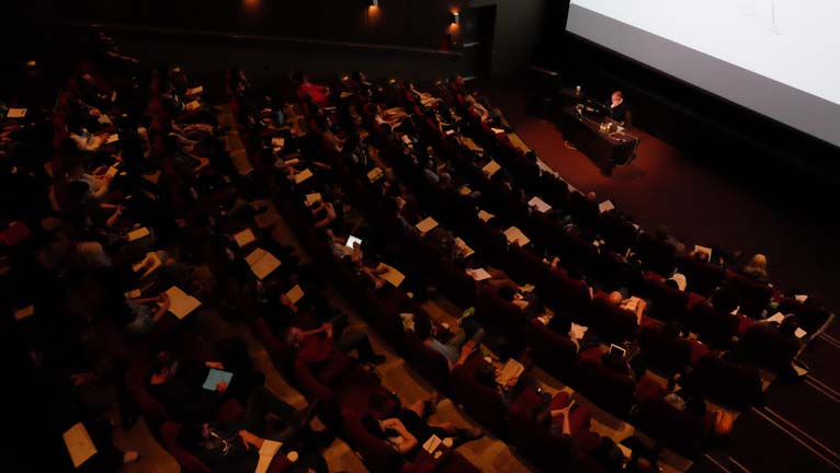
April 29th, 2017. It’s a rainy day in Vancouver and most have only just had their first sip of coffee, but no one here seems to mind. They’re all too busy taking in the unforgettably inspiring Borja Montoro. Welcome to Spark CG Society’s day long masterclass in character design.
![]() Photo credit: Ana Norambuena
Photo credit: Ana Norambuena
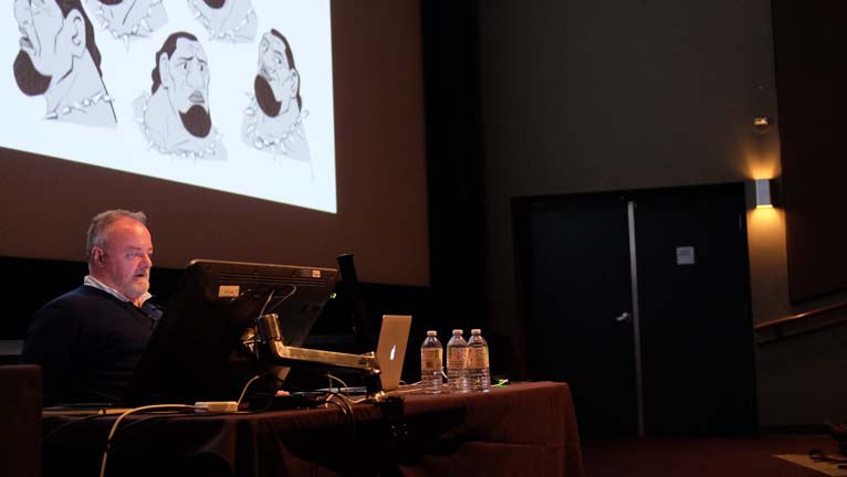
Having had a hold-up at home, I walk into the venue an hour late, rushed and out of breath. I tiptoe up to balcony seating and peer down at a full house. In front of us, tiny from up here, but with the voice and personality to bend the limits of this room, sits Borja and his warm welcoming smile. He’s walking us through his work on Moana, flipping through slides of Chief Tui and chuckling with jovial self-deprecation: “They always give me fat characters… I don’t know why, but they always do.” With his deep baritone laugh, he’s just let us in on secret #1: he doesn’t take himself too seriously. It’s refreshing and you can’t help but love him for it.
![]() Photo credit: Ana Norambuena
Photo credit: Ana Norambuena
The first half of the morning is spent looking through a selection of his most recent repertoire. Over the course of it, we start to get a sense for his process, realize that he treats all characters like they are hero characters, and glean entertaining little insights. Who would have guessed that Hei Hei was originally cast as an angry chicken? That Gru was intended as a secondary character? That Hopps’ dad was initially envisioned as a Brooklynite hooked on carrot juice? Or that there were originally no minions??! All this shared with ease and honesty. Case in point, lesson learned on Moana: “don’t Google naked chickens,” he playfully warns us.
“I sing a lot when I draw” is my first glance into his working style. And this permeates his entire talk. Most 2D animators in my circle of friends, naturally add sound effects when re-telling a story, even in normal conversation. Borja takes this a few steps further. For him, creating characters requires fully embodying them, living in their shoes and their voices, imagining what their normal interactions are, and voicing those conversations aloud. He keeps us in stitches all day with his over-the-top, slice-of-life impersonations.
![]() Photo credit: Ana Norambuena
Photo credit: Ana Norambuena
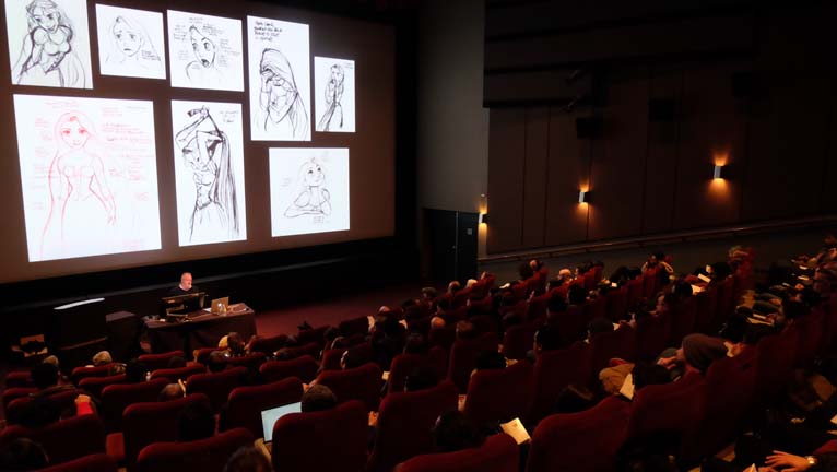
What’s the difference between character design for 2D animation vs. 3D animation? From Borja’s perspective, it used to be that 3D animation only used 2D character design for the initial stage of inspiration. After that point, a 3D model was created and any further character design was done directly in 3D. However, for him, that all changed with Tangled. It was a turning point, where 2D draw-overs were being done over 3D models and animation. “Now that feels more likely as an option,” he explains, as he pulls up a scary-looking 3D model of Despicable Me’s Gru as a baby. We soon see the 2D design he’s done as an alternative, based on the model.
![]() Photo credit: Ana Norambuena
Photo credit: Ana Norambuena
Borja’s sources of inspiration are diverse and plentiful, from Milt Kahl to his contemporaries, such as Shiyoon Kim and Nicolas Marlet. He’s generous with his anecdotes and his reverence for his peers. And through this, we learn that some character designs are done by animators and some by concept artists. Borja’s worn both hats and always has a number of projects on the go. “I have six kids, and they eat like this [he gestures out, wide]. And they don’t stop eating” he offers, as explanation for his prolific body of work.
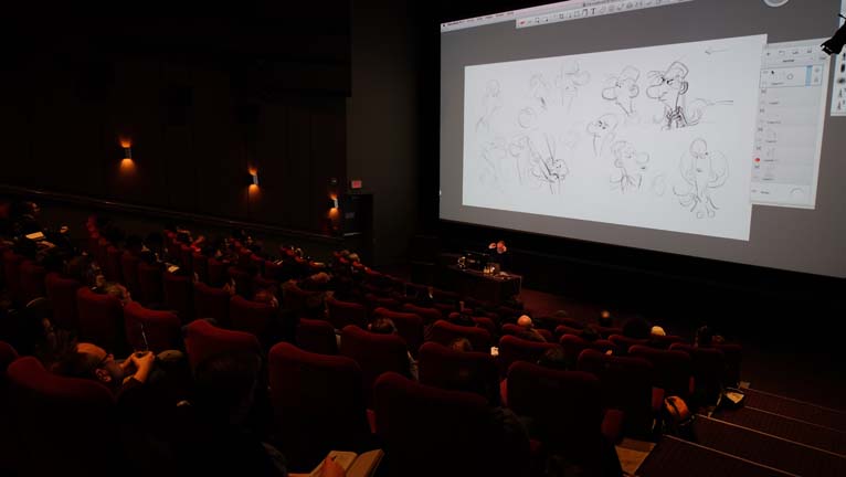
And thus ends the slide portion of the presentation. On to the heart of the masterclass, Borja walking us through his process via a live drawing session. Interesting side note, despite his incredible talent, if you ask him if he’s an artist, he’ll unfailingly answer you no. Why?
“I am not an artist. Artist is a [too] big name. If I call myself an artist, what would I call Velázquez? Velázquez is an artist. Van Gogh is an artist. I can’t call myself an artist if I call them the same. I would have to look for a new name for them. It’s easier to [find] a new name for myself. I consider myself a professional draftsman. It’s good enough; I live with it. I don’t have to call myself an artist. That’s too big. That’s too big for me.”
![]() Photo credit: Ana Norambuena
Photo credit: Ana Norambuena
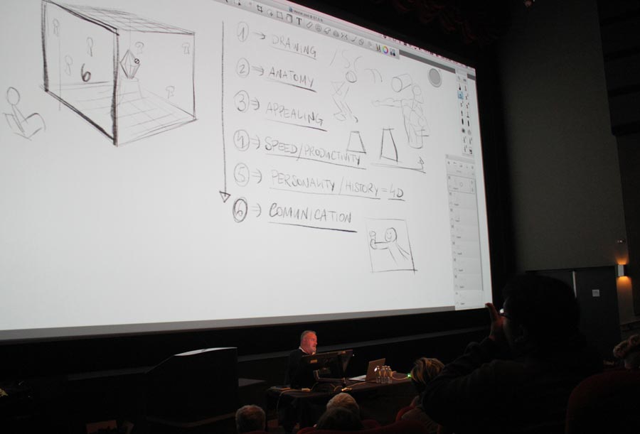
A blank canvas in front of him and stylus in hand, our humble draftsman begins by presenting us with his “treasure box” and its 6 sides. Each face represents a necessary quality required to be a good character designer. These key principles provide the framework for the rest of our day together:
- Know the rules of drawing and be able to describe an idea in very simple terms.
- Think of a character as a volumetric shape; apply the rules of anatomy even when drawing cartoon characters.
- Although “appealing” is subjective, there are still some things that will always apply.
- Speed/productivity — “you don’t just need to know how to do it, you need to know how to do it fast — know the process and follow it with good speed”
- The importance of personality and history for the character. “Adding time. You need to give information on what happened before and after, even if it never appears in the movie.”
- Communication, the most important of all the principles.
![]() Photo credit: Diogenes Ostuni
Photo credit: Diogenes Ostuni
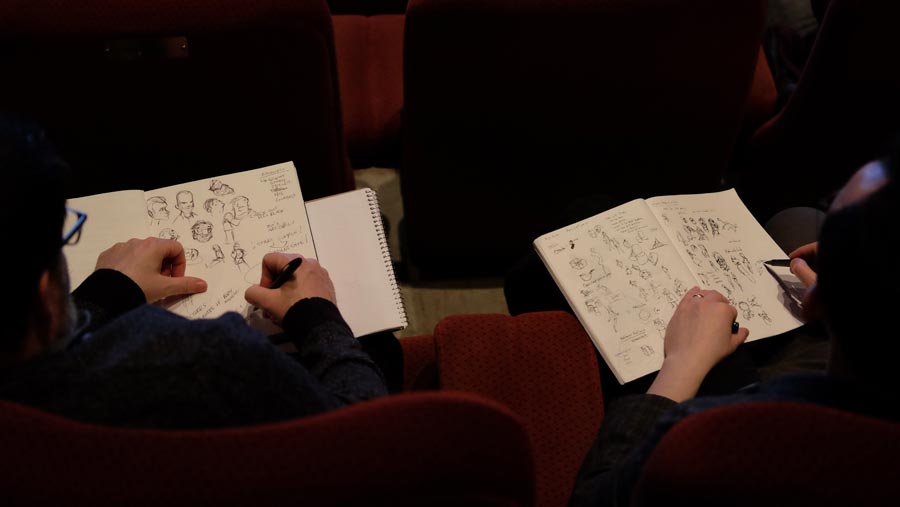
We start with principle one and are given the age old recommendation. “Draw. You need to draw every single day. That’s the best way to understand the rules.” I can’t help but imagine the bevy of art teachers that I’ve had over the years clucking their disapproval that it’s taken me this long to embrace the fact: “drawing: that’s the ground floor [the foundation].” Somehow Borja’s Father Christmas voice and skills on the page make it a more palatable truth. With renewed hopefulness, I start sketching amidst my notes.
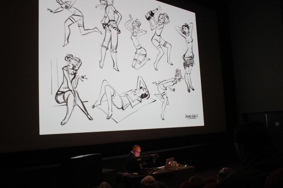
Next up, anatomy and a trick I wish someone had given me years ago: if all else fails, start with a simple cycling outfit. The traditional unflattering spandex version, with lines that aptly delineate major muscle groups, “start there and add more as you go.”
We skip forward to speed (no pun intended) and gain a better sense for what this and productivity mean in Borja’s character design world. “It’s not up to us to say what the character is. I don’t create the character, I just design it.” To do so, “I need to know what they’re asking for and what I have to do.” He shares anecdotes of working with his students, brilliant minds who create beautiful work but are still learning. Through this, we start to better understand what he’s getting to in a professional context “it’s not that the drawings they do aren’t good. They just sometimes don’t need to be there.” Character sketches aren’t meant to just be beautiful standalone pieces of art. They’re meant to give insight into and depth to the character.
![]() Photo credit: Diogenes Ostuni
Photo credit: Diogenes Ostuni
We now jump back to “appealing” and its importance: “We sell our drawings. What we create is meant to be seen on screen; it’s meant to be liked.” We need to create characters that “you watch and don’t get tired of watching.” To illustrate his point and demonstrate that there is a base level of appealing that we can all agree on, he Googles “Tinkerbell,” then updates the search to “Tinkerbell fan art.” He discusses what works and doesn’t in a few of these designs and shares with us an exercise he sometimes puts to his students: take one of the “bad” drawings and make it appealing. Secret #2: he has a private Pinterest folder called “bad drawings” where he stores relevant gems he’s drawn or found. He revisits it when he needs to remember what makes a character appealing.
And now, we’re on to personality and history, what makes a character transcend to 4D. Your characters “need to have something to tell you they’re living [alive].” You need to feel where they are, what they’re experiencing. For Borja, this means imagining himself in their place, singing the song they have in their head, talking to the person they’re around at that moment. Which brings us to “time.” For Borja, there has to be a sense of time. Not just what the character is like in general, but what he or she is doing at that exact moment. To ground them in reality, he gives all his characters names before he draws them. “I need to believe in them, or no one else will.”
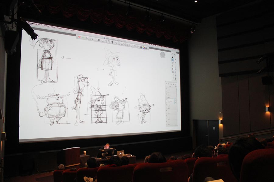
While entertaining an offbeat imaginary conversation with the characters he’s now drawing on-screen, Borja extolls the importance of showing the client lots of different possibilities in the early exploration phase. First, taking a little girl scout character and making subtle changes to her, he creates a character sheet of options (all holding the same pose, all quite similar despite hair and facial feature changes). Next, he begins by drawing extremely different silhouette shapes and filling each in with a new drawing. Thus, he creates a roster of distinctly different characters, each imbued with her own unique personality. Make bold choices and bigger differences. “Force yourself not to do the same thing” he tells us, wisely.
![]() Photo credit: Diogenes Ostuni
Photo credit: Diogenes Ostuni
“Creativity doesn’t always come easily” he laughs. “Sometimes you have to help it along,” he tells us, as he dissects various rectangles into different pieces, forcing himself to create short and long torsos, large and small heads, big and tiny feet, as prescribed by the framework he’s created.
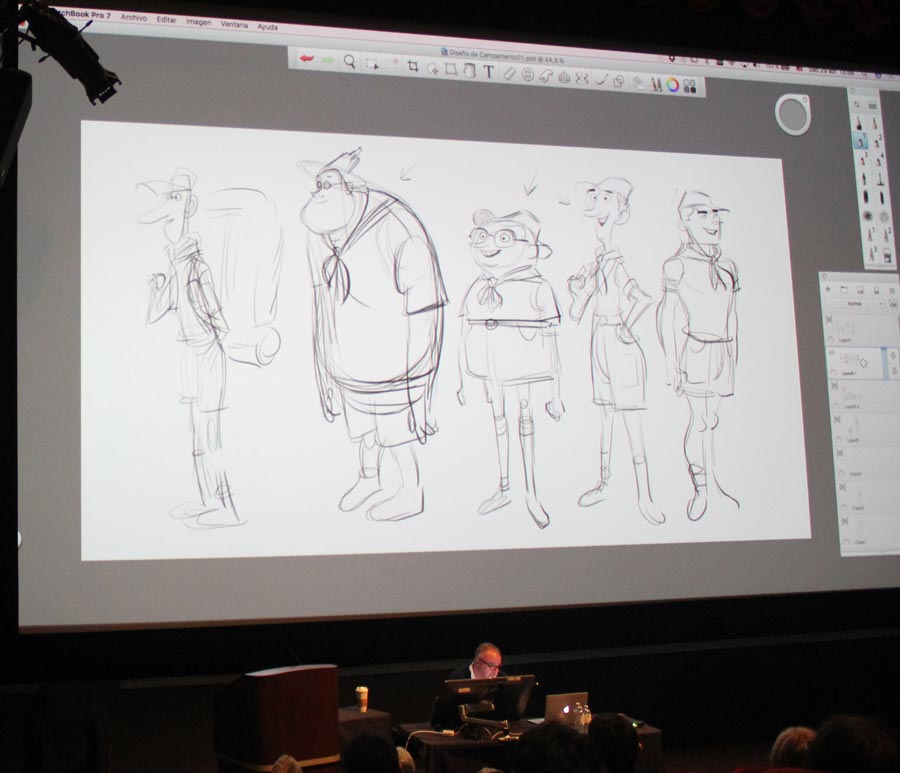
Our little girl scout design has come quite a ways and we have a good sense of her personality and situation thanks to Borja’s child-like “I know you brought me to camp because you hate me” passive-aggressive retort to her parents. But before taking her design any further, he cautions us to move the other main character, the camp counselor, forward as well.
![]() Photo credit: Diogenes Ostuni
Photo credit: Diogenes Ostuni
Encouraged to participate, Borja’s now told us we, the audience, are the producers of this project. A cacophony of voices as we each shout out our preference of design for the camp counselor. 3, no 5, no 7! Definitely 7! My voices strains in the balcony. But Danny-DeVito-meets-Urkel doesn’t make the cut. Sigh.
Although the conversation has been mostly one-sided for the past few hours, there’s a palpable sense of complicity in the room. It’s as if we were sharing an afternoon with an old friend. One who has the incredible knack of imparting knowledge under the guise of making us laugh.
But back to camp counselor. Borja’s still fielding responses as he tells us “the important thing is not that you prefer one over the other, it’s that you have a variety of options.” Each one gives us different possibilities. And before we can make a final choice, we’re told we need to choose the pairing of him and the girl, as they need to exist together in a line-up.
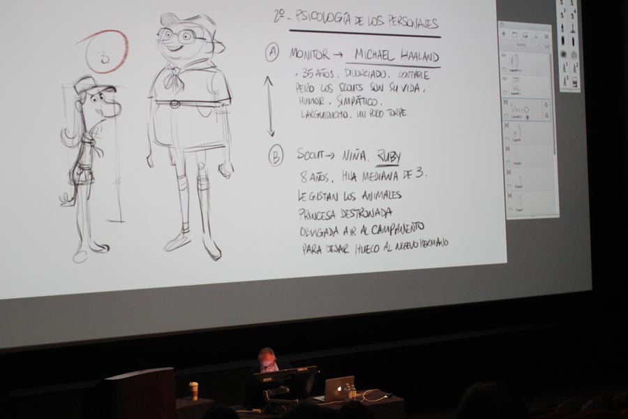
We’re fleshing out her design now, giving her a little more personality. Borja’s reminding us that we need to consider her as a volumetric entity, keeping in mind that we’ll be passing her along to the modeling department. It’s all a question of “not just knowing what to do, but also when to do it.” When do you keep it simple, when do you add details, etc.
He’s playfully laughing at our final pairing, calling us out as entertaining clients “As a designer, you want to help. But sometimes, they don’t want to be helped.” He’s putting the design through the paces, flipping it on its axis to see that it still works, cleaning it up. We’re “no longer looking for options. Now we’re trying to make it more believable, more appealing.” One little change to the eyes and I marvel at how that changes her expression so drastically. It’s incredible seeing this character come to life before us.
![]() Photo credit: Diogenes Ostuni
Photo credit: Diogenes Ostuni
Borja’s effortlessly drawing away, putting the characters in context, unveiling their personalities as he discovers them, little by little. “He will likely have 100 times more things than her, but he knows how to pack light. She has more stuff, but nothing essential.” Before the sentence is even complete, their backpacks are done. You can almost feel the weight of hers and the springy lightness of his. Or is it Borja’s narration that gives us that impression?
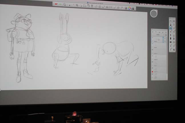
We’re working out poses for them now. “Don’t get too technical or accurate now. Don’t worry about where the ulna should go” Borja warns. “Things will be stiff if you draw like that.” Instead, go to poses directly. “Put the character there and breathe him in. Just go for it, with not much order.” A ridiculous, squatting nerdy character (via gesture drawing) appears on screen. “This is about fun, about making entertainment. You have to play.” The scene unfolds before us, our camp counselor is crouched down, looking at something: “Ooo, what’s that? Little ants at work. How lovely.” This is the point at which to try various different options, fast. “Everything creative is based on mistakes. Sometimes the best way to learn is to try something and see what doesn’t work.”
Borja tells us he sometimes prefers working in TVPaint at this stage, in order to get a quick sense of how well the poses work. He prefers roughing it out there, then exporting as a PSD file and completing it in Sketchbook.
![]() Photo credit: Diogenes Ostuni
Photo credit: Diogenes Ostuni
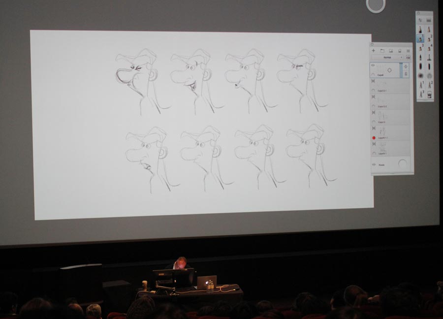
And now we’re on to facial expressions. Borja suggests we draw up to the shoulders, so you can see the tilt in the head. That gives a lot more information to the viewer. And in an expressions sheet “don’t keep the same pose and just subtly change the expression.” He illustrates what he means.
![]() Photo credit: Diogenes Ostuni
Photo credit: Diogenes Ostuni
“That looks too mechanical. It may be useful for the modeling and rigging departments, but it’s not helpful to show range.” What he’s aiming for: “I’m trying to cover her whole story. If an animator looks at my expression sheet, they can always find an answer for the situation the character is facing.”
He could have just drawn the girl scout as angry, as that’s how we were introduced to her. But Borja encourages us to always think of the contrary. “Go in some other direction. Explore.” And “don’t be afraid of not knowing how to draw. Just keep going. Have fun with it.” During one of the breaks, I chat with a friend who is an animator at one of the studios here in town. He mentions how much that sentiment resonated with him, that it was reassuring: “I draw crappy drawings and I give up. But seeing that Borja does that too, but keeps going and then makes it into something incredible, that’s inspiring. That gives me confidence.”
![]() Photo credit: Ana Norambuena
Photo credit: Ana Norambuena
We’re nearing the end of the day and Borja is still talking and drawing up a storm. He’s opened up the floor to questions and is drawing his way through the answers, while regaling us with stories and anecdotes. “They aren’t paying you for what you’ve done, but for what you can and will do. That you’re full of ideas.” He tells the attendee concerned about showing his best work in an online portfolio and having it potentially stolen. “You’re creating a character, not just a drawing” he tells another. “I love people. Putting myself in their shoes, trying to be there with them. Really understanding them.” And it shows. Not just in his work, but in his demeanor, openness and authenticity.
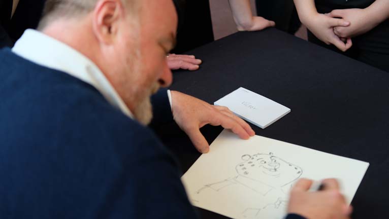
I’ve spent an entire day locked away in a dark room in seats that are slowly turning my back against me. But I wish it didn’t have to end. That’s the magic of Borja Montoro. I hope he won’t mind me upgrading his title to master draftsman. I feel lucky to have spent a day with someone so real, funny and talented. I’m sure others will join me in the sentiment.
![]() Photo credit: Ana Norambuena
Photo credit: Ana Norambuena
And to anyone who attended, I’m guessing the word “cheese” will be met with laughter for at least a few months to come 😉

Leave a Reply
You must be logged in to post a comment.