This is the second interview in a series by Jessica Fernandes about the animated film "Smurfs: The Lost Village." Republished with permission from Spark CG Society.
"Smurfs: The Lost Village" immerses us in the world of our one-foot-tall fantastical friends. In Part I of our look behind the scenes, we explored how the design process unfolded and influenced all aspects of the film. Now, with the stage set, we sit down with Valerie Morrison, Supervising Animator on the project, to dive deeper into the animation process that brought these characters to life.
Having grown up with the Smurfs, or Les Schtroumpfs as I’m used to calling them, I was really impressed by how well this reboot handled the translation of the property from 2D to 3D. It did a great job of honouring the look and feel of the original comics and TV series. What was involved in making that leap?
We worked very closely with Peyo’s [creator of the Smurfs] daughter Véronique to try and ensure everything felt true to the original comics and cartoon. And we continually referred back to the source material in order to maintain authenticity.
As for how we achieved this in practice, Sony’s been making a lot of movies recently that have more of a graphic, 2D-looking style. Hotel Transylvania is the most obvious example of that, as well as Angry Birds and Storks. A lot of the animators on Smurfs had worked on those movies and as such, were already familiar with the tools and rigs we used to achieve that look.
Did you develop any new animation tools for Smurfs?
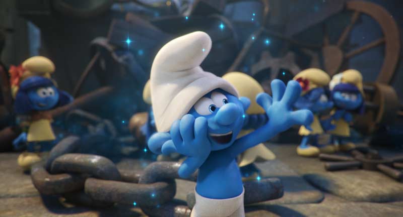
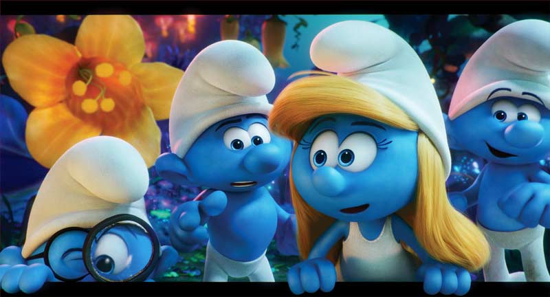
Not that I’m aware of. But we did have to develop new approaches for certain items. For example, the Smurf eye design in this film was two eyes touching each other without any separation between them. That’s not something that we had ever done before.
Consequently, we had to figure out how to get the pupils to properly function as they got closer to the invisible centre line. And we needed to re-visit how to pose the nose around the eyes to make it look the most Smurf-appealing as possible. Establishing new rules and approaches for these situations were challenges we faced.
A lot of what I saw felt reminiscent of old-school Disney animation. What were your main sources of inspiration and reference?
Our director, Kelly Asbury, really likes old Disney animation. He would often refer back to the Mickey Mouse cartoons, especially The Brave Little Tailor. It’s the one where Mickey kills seven flies and ends up having to fight a giant (laughs). It’s one that was made a long time ago [1938, animated short].
Mickey Mouse, The Seven Dwarfs and Snow White were all big influences for us. We looked to them for how cartoony, appealing and squishy their animations were.
The smear frames added authenticity to the characters and actions in the Smurf universe. Can you tell us how this effect was achieved in 3D?
We approached this in a few different ways. We used the scales that were built into the rig to make something wider or larger. On top of that, we also had tools that allowed us to make our own blendshapes for specific frames. So if a rig only got us part way to what we really wanted, we could go in and model the specific shape we wanted for that frame. That way we could get pretty much whatever we could imagine, which was really cool. If needed, we could also add extra appendages and make things smear for long distances.
To add emphasis and humour, we sometimes also used the lines and stars effect (that’s often seen in 2D animations when a character gets hit).
What was the most fun sequence or character to animate?
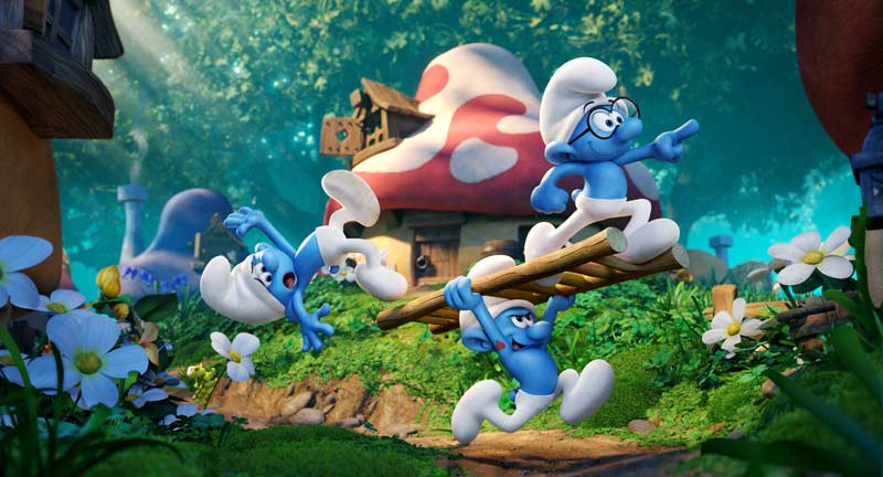
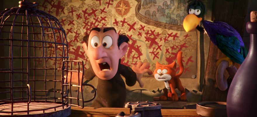
It’s hard to think of a specific sequence, as everyone had a lot of fun overall with the show. In terms of the characters, a lot of people really enjoyed animating Clumsy and Gargamel. I worked on a shot with Clumsy and can attest to him being a lot of fun to animate. It’s great to get in there with bouncy and active characters, or ones with big personalities.
How about the most challenging?
I didn’t work on it, but I’d have to say the magical river sequence was the most challenging. There was a lot of experimentation and back-and-forth involved as the animation and FX departments had to collaborate closely on this sequence. First the animators animated the river’s movement to get it flowing correctly, then FX went in and added water effects on top of that. It was technically challenging, but a fun challenge.
Mike had mentioned the adjustments that were made to connect the eyes and enable floating eyebrows. I also noticed eyelid (top and bottom), eyelash and eye crease (for Papa Smurf) activity on top of this. Were those all things you controlled via sliders or was some of it automated? And what was it like having so many variables to play with?
Much of what you mentioned was actually done by hand. It’s really nice having a lot of the controls on the rig, it gives us a lot of flexibility. I haven’t counted, but I’m sure there are hundreds of controls on the face. Having such a large number of points we can move on the eyebrows and mouth, just to get the exact shape we want, is great. That’s not to mention controls for the socket lines and the eyelids.
It’s a lot to keep track (laughs). But we have a robust library system to help us manage that. When someone goes to make a pose, they can start with something from the library as their base pose and adjust and alter things from there. That way not everyone has to touch every single control when they’re trying to get a pose. It’s a nice starting point.
It’s really nice to be able to add all the details to get exactly the look we’re going for. And there are a lot of details to consider… like how the eyes work together. There are little blue triangles at the top and the bottom of where the two eyes meet. We had to control where those triangles are located and make sure that they pointed down towards each other exactly along the imaginary line between the eyes. Other details to consider — smoothing out the unwanted creases that appear on the face with certain poses. We always had to go through and double-check, making sure everything was just perfect.
What can you tell us about animating the radioactive bunny stampede and dragonfly chase sequence?
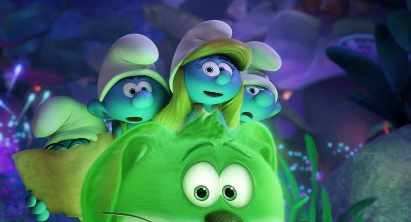
We used crowd tools to help us with this type of animation. Essentially, we animated a single bunny or a single dragonfly and cached that rig and geometry, which made it really light. That way we could have a bunch of cached characters in a scene without it being too heavy. As needed, we could put the rig back in and work with, and take it back out once done. Doing this, we could see how everything was moving and interacting with each other without having a hundred full characters in the same scene file. And on the cached characters we had simple controls that allowed us to move and offset, etc. so we could add variety between the character instances in the scene.
We used this method for all large crowd scenes, including those in Smurf Village and the Lost Village when there were a lot of Smurfs in a shot.
I noticed nice attention to detail in secondary and tertiary animation. How was that achieved?
Some of that was taken care of by the animation department and some by the character effects department. For example, animation handled the hat and eyelash animation. We have a tool that layers on a quick procedural animation, which gets us 80% of the way. Then we go in and adjust, making the action bigger or smaller and further tweaking by hand. For the more complicated items like Smurfette’s hair, the girls’ dresses and Gargamel’s robe, we rely on the character effects department. They do an incredible job of getting very realistic looking cloth and hair.
I absolutely loved Gargamel’s animation. Especially when he went into his delightfully exaggerated soliloquies. Can you walk us through how this is achieved?
Basically, for every character that we work on, we start by testing the rig. Animators talk to the riggers and say things like “hey it would be great if we were able to open the mouth a little more here” or “when we open the eyes this much, we’re starting to get a wrinkle.” The rig that comes out of those back-and-forth interactions is what we use to build on — what works for what we need to achieve most of the time.
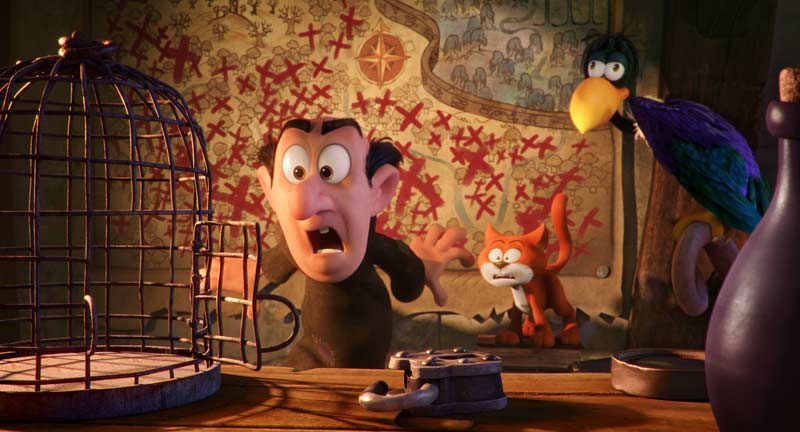
However, for the really extreme poses, we use the blendshapes that I had mentioned before. For example, if an animator really wanted Gargamel to make a crazy face with super wide open mouth, etc., what we would do is break the rig. We’d break the jaw where we need to, move the eyes to where we want, etc. It would be a mess, it would wrinkle all over the place, intersect badly, etc. But then we’d make a blendshape to fix that up and get it to look nice. What’s nice is that we can do that stage in the animation department itself, without having to rely on another department, as we have the tools to do so.
How were the animation tasks split up for a character like Gargamel? (i.e. Was one animator assigned to each of Gargamel's sequences, or did different animators handle different aspects of his performance)?
There were multiple animation leads on the film and each was assigned to different sequences. A lead would get a specific Gargamel sequence and all the shots in that sequence would be split up among the 10-15 animators that the lead managed.
There were a lot of people working on Gargamel. For consistency and if there was enough inventory to go around, sometimes animators would be assigned 3-4 shots in a row. For example, there’s an animator who did the really cool soliloquy shots that you mentioned — when Gargamel’s quite still in frame, but making these great acting choices with his face. And there was this one amazing animator who did the shots where Gargamel transformed into his wizard-mane, which was really cool.
So there isn’t a lead who does all the main action, or sets up the key frames on a shot, and then someone else who goes and does cleanup?
No, for the most part the way we work at Sony is that everyone works on everything in their shot. So all animators get a shot between camera cuts – it’s all up to that one person to animate. The exception is large crowd shots. Those are sometimes split up since very background characters may have already been animated in advance as cycles by a different animator. Or, if we’re really in a hurry on a shot, we may need to split it up. But, for the most part, animators animate everything in their shot, which is really cool. It gives you a nice sense of ownership.
How many animators ended up working on the film?
There were about 7 leads and 100 animators in total. On average, there were 80 animators working simultaneously. In the last few weeks there may have been all 100 working together.
And was that all here in Vancouver? Or including those at the Culver City studio as well?
I would say at least 90% of the animators were in Vancouver, with the rest down in California.
Is there anything else you’re particularly proud of that you would like to share with us?
The dance sequence at the end of the film, where all the Smurfs come back to Smurf Village and are celebrating alongside their new friends (dancing to the Megan Trainor song). That was a pretty last minute idea. There weren’t any storyboards or layout for that sequence. It was more like: “ok everyone, come up with something fun.”
We started asking ourselves, how would the Smurfs dance? How would farmer Smurf dance? How about Vanity Smurf, how would he dance with himself in the mirror? Pretty much everyone was throwing out ideas, putting in their own cameras and their own locations and making it really funny. Not all the ideas made into the movie, but it was a lot of fun just trying to come up with creative options. And there was complete freedom on it, which was pretty cool.
Sounds like fun! How long was that brainstorming phase?
It was a back-and-forth. We would make rough tests, send it to the story and editorial teams and they would cut things together and see how well the pieces fit. They would come back to us with “we really like this one” or “how about we try something a little more like this.” It probably took 3-4 weeks from the beginning of the idea until we finished the sequence. It was a lot of fun.
The result speaks for itself as you can’t help but get carried away following Smurfette and her friends along their journey of adventure, peril and excitement. Thank you to Valerie and the team at Sony for allowing us an inspiring peek under the hood.
And if you missed Part I of this series, where we chatted with Mike Ford (VFX Supervisor on the film), you can check it out here.
All images and clips copyright 2017 Sony Pictures Animation. All Rights Reserved.
Leave a Reply
You must be logged in to post a comment.